
Create a Animated Rotating Circle Menu Using Basic CSS.
In this article I 'll be talking about how we can arrange items around an item and creating a simple animation. At last we will get a similar design as above. You can check an live implementation here. I have implemented this on that website.
Real life Demo: Here
Download Source code: Here
Related: How to setup a local custom webserver with Apache, MySql and PHP for development.
Firstly, you need to be familar with basic HTML, CSS, JavaScript and jQuery.
As we know that, CSS have not any features or any function that automatically places divisions or any elements in a circle or around a circle so we are using a simple technique of series of transformation. By rotation and translation and again rolling back the rotation we can get as our wish.


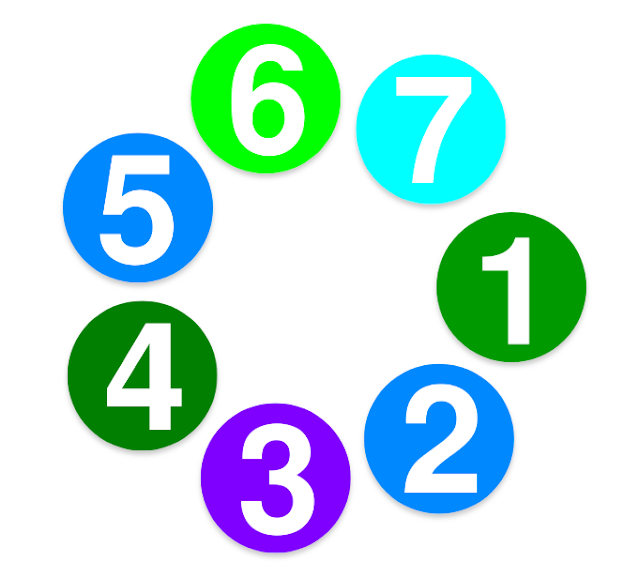
Here in the above images, diameters of outer and inner images are 250px and 40px resp. Now, we have placed the inner image to the center of the outer image. Now, Moving the centered image to the desired loctation of the circle, here at the edge 45 deg clockwise. And by repeating this we can place as many images as we want (just changing the rotating angle).
Steps Performed:
- rotate the image @ 45 deg clock-wise i.e. rotate(45deg)
- translate (single axis) 125px i.e. translate(125px)
- rotate the image @ 45 deg anti-clock-wise i.e. rotate(-45deg)
.deg{
    transform : rotate(45deg) ;
  }

 .deg2{
    transform : rotate(45deg) translate(125px);
  }
 .deg3{
    transform : rotate(45deg) translate(125px) rotate(-45deg);
  }
Now, as we know how to place the images in a circular form, we are going to arrange a certain number of images in that form.
Let us take a circle of size 26em (diameter).
CSS code for the circle:
.circle-container{
   width: 26em;
   height: 26em;
   margin: 13em auto;
 }
We have here created a division of size 26em by 26em and made the div center horizontally. This division is just an imaginary area (not visible) to place our images.
Let us take the size of image to be 10em.
CSS code to position the image at the center:
.circle-item {
   list-style: none;
  }

.circle-item > li > img {
   display: block;
   position: absolute;
   top: 50%;
   left: 50%;
   width: 10em;
   height: 10em;
   border-radius: 50%;
   box-shadow: 0 4px 8px 0 rgba(0,0,0,0.2);
   border: solid 0px tomato;
   -webkit-transition: .15s;
   transition: .15s;
  }

.circle-item img:hover {
   box-shadow: 0 4px 8px 0 tomato;
}
Above code positions all of the images at the center of the imaginary division created above using the absolute position property.
Now, positioning all of the images at the correct places.
In this case we are arranging 7 items. Now, determine the difference between each items in angle so we can place at an equal distance. To do so,
Required difference = 360/7 = 51.54 deg ~ 51 deg (approx)
Translation size = 26em / 2 = 13em
Code to place all 7 images at correct places:
We need 7 images so 7 individual placing is needed. Each code places the images at correct positions. It first rotates, then translates and again roll back the rotation. The process is explained above.The difference between the angle is approximately 51 deg.
HTML Code:
In the above example, first an division is created of required size and then using absolute positioning property we position images at the center. Calculating the required value we transform those image to their expected position.
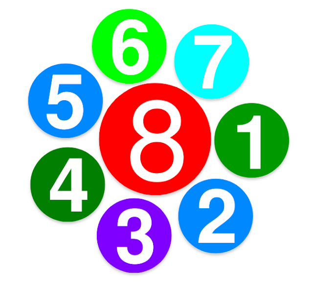
Now, There is space in between the images, we can place a big image over there by placing the following CSS code and another List element. I've placed at the last position in the sample file given at the end of the post..
CSS Code for the center image:
You can also make this responsive by decereasing/increasing size on media queries. Now, Animating the circle by rotating. Inorder to rotate the circle we just need to update the rotating angle (adding 1 at an regular interval of time).
Code To rotate the Circle just created:
In the above code we call a function, in an regular interval, that autoupdate the rotating angle.
These codes resumes and pause the rotation on mouse leave and enter on the images except the center one.
.circle-item > *:nth-of-type(1) {
   transform: rotate(0deg) translate(13em) rotate(0deg);
  }
.circle-item > *:nth-of-type(2) {
   transform: rotate(51deg) translate(13em) rotate(-51deg);
  }
.circle-item > *:nth-of-type(3) {
   transform: rotate(102deg) translate(13em) rotate(-102deg);
  }
.circle-item > *:nth-of-type(4) {
   transform: rotate(153deg) translate(13em) rotate(-153deg);
  }
.circle-item > *:nth-of-type(5) {
   transform: rotate(204deg) translate(13em) rotate(-204deg);
  }
.circle-item > *:nth-of-type(6) {
   transform: rotate(255deg) translate(13em) rotate(-255deg);
  }
.circle-item > *:nth-of-type(7) {
   transform: rotate(306deg) translate(13em) rotate(-306deg);
  }
We need 7 images so 7 individual placing is needed. Each code places the images at correct positions. It first rotates, then translates and again roll back the rotation. The process is explained above.The difference between the angle is approximately 51 deg.
HTML Code:
<div class = "circle-container">
     <ul class="circle-item">
      <li><img src="1.png"</li>
      <li><img src="2.png"</li>
      <li><img src="3.png"</li>
      <li><img src="4.png"</li>
      <li><img src="5.png"</li>
      <li><img src="6.png"</li>
      <li><img src="7.png"</li>
    </ul>
   </div>
In the above example, first an division is created of required size and then using absolute positioning property we position images at the center. Calculating the required value we transform those image to their expected position.
Now, There is space in between the images, we can place a big image over there by placing the following CSS code and another List element. I've placed at the last position in the sample file given at the end of the post..
CSS Code for the center image:
.circle-item > li:last-child > img{ // Increase the size of last element.
   width:15em;
   height:15em;
 }

.circle-item > *:nth-of-type(8) { // Position it using 'Hit and Trial Method'
   transform: rotate(228deg) translate(3.6em) rotate(-228deg);
}
This is the final product. CSS transform is not supported in old browsers and IE8. Also you can use
-webkit-transform: rotate(90deg) translate(13em) rotate(+90deg);  /* Chrome, Opera 15+, Safari 3.1+
      -ms-transform: rotate(90deg) translate(13em) rotate(+90deg);  /* IE 9
          transform: rotate(90deg) translate(13em) rotate(+90deg);  /* Firefox 16+, IE 10+, Opera
You can also make this responsive by decereasing/increasing size on media queries. Now, Animating the circle by rotating. Inorder to rotate the circle we just need to update the rotating angle (adding 1 at an regular interval of time).
Code To rotate the Circle just created:
$(function() {

    var deg = 0;
    var rotate = 1;
    var club_rotate = setInterval(club_rotate, 25);
    $('.circle-item > li').not(".circle-item > *:nth-of-type(8)").mouseenter(function() {
        rotate = 0
    });
    $('.circle-item > li').not(".circle-item > *:nth-of-type(8)").mouseleave(function() {
        rotate = 1
    });
    function club_rotate() {
        if (rotate == 0) {
            return
        }
        deg = get_deg(deg + 1);
        var deg0 = deg;
        var $data = $('.circle-item').children().not(".circle-item > *:nth-of-type(8)");
        var length = 13;
        if ($(window).width() <= 540) { // inorder to make it responsive, decreases size to 7em if window size is less than 570
            length = 7
        }
        $data.each(function() {
            $(this).css("-webkit-transform", "rotate(" + deg0 + "deg) translate(" + length + "em) rotate(-" + deg0 + "deg)").css("transform", "rotate(" + deg0 + "deg) translate(" + length + "em) rotate(-" + deg0 + "deg)");
            deg0 = get_deg(deg0 + 51)
        })
    }

    function get_deg(deg0) {
        if (deg0 > 360)
            return (deg0 - 360);
        else return deg0
    }
});
In the above code we call a function, in an regular interval, that autoupdate the rotating angle.
var club_rotate = setInterval(club_rotate, 25);It calls the function club_rotate() at an interval of 25ms (every 25 milliseconds). - club_rotate() - This function auto increase current angle by 1 and update in HTML.
- get_deg(deg0) - returns the corrected degree.
$('.circle-item > li').not(".circle-item > *:nth-of-type(8)").mouseenter(function() {
        rotate = 0
    });
    $('.circle-item > li').not(".circle-item > *:nth-of-type(8)").mouseleave(function() {
        rotate = 1
    });
These codes resumes and pause the rotation on mouse leave and enter on the images except the center one.
The JavaScript codes used here is just an ideal demonstration. Just to provide a concept.
How do I link those 7 images to another source with messing the animation up?
ReplyDeleteI like this web site very much, Its a really nice post to read and get info . website designers nyc
ReplyDeleteI’m glad to become a visitor in this pure site, regards for this rare info! website design company nyc
ReplyDeleteSome truly quality blog posts on this web site , saved to my bookmarks . web design agency new york
ReplyDeleteThe application is available free and there is a paid version as well. Twitter Training – Getting started with Twitter Twitter is just another example of the light speed at which communications are catapulting forward, and corporate America (as well as home business online marketers) should do our best to keep up. nyc web designer
ReplyDeleteThis comment has been removed by the author.
ReplyDeleteThis comment has been removed by the author.
ReplyDeleteThere is noticeably a lot of money to comprehend this. I suppose you made particular nice points in functions also. san francisco design agency
ReplyDeleteWhen I originally commented I clicked the -Notify me when new surveys are added- checkbox and from now on if a comment is added I receive four emails with similar comment. Possibly there is that is you are able to get rid of me from that service? Thanks! best branding agencies san francisco
ReplyDeleteBut yet, regardless how good you will be accompanied by treating a huge rig, sometime currently, there are a situation in places ought to do selected information treating; and furthermore primarily based on your real age yet fitness level, free weight in your caravan it is a fantastically excessive do exercises. pre owned awnings design agency san francisco
ReplyDeletePreviously you must have highly effective web business strategies get you started of getting into topics suitable for their web-based organization. educational ux san francisco
ReplyDeleteThanks for the excellent article. this Is Excellent information for the experience in CSS.
ReplyDeleteCloudi5 is the web design company in Coimbatore. Cloudi5 Technologies has built many responsive websites. Many websites are successfully launched on the web without any issues. Cloudi5 is the best in the industry for creating professional websites.
Web Design Company in Coimbatore
Black Ops Zombies is now available… [...]Take a look here[...]… car key replacement london
ReplyDeleteThis comment has been removed by the author.
ReplyDeleteI have been trying for 4 days now and still scratching my head on this.
ReplyDeleteHow do I add text below the images?
This is one of the best and most wanted field that is also recommended by the writers of Buy Dissertation Online because through this, any person can earn a lot of money. Many professionals have joined it and they are satisfied because they have secured their future. Do you like this skill and have you any idea about its scope in future?
ReplyDeleteThis is very nice and amazing tips for basic CSS and I was searching for this to learn basic CSS Script to Write My Dissertation on it. Nowadays I am concerned with help with dissertation, They teach me about the basic CSS but for learn furthur I will follow up your blogs too. Thanks for giving me this information.
ReplyDeleteIf you are a legitimate small business owner and would like to take your business to deliver your goods or services to the online world, one of the many questions that you may not know the answer to is which web hosting to choose for your website. There are literally thousands of web hosting services that you will probably run into during a search for the right one. It is important to know some characteristics of ssl a good web host as well as a few questions to keep in mind while searching for one.
ReplyDeleteDo people still use these? Personally I love gadgets but I do prefer something a bit more up to date. Still, nicely written piece thanks. power off button
ReplyDeletehttps://zyneventures.com/
ReplyDeleteWow! I just visited zyneventures.com, and I must say, I'm impressed with the range of SEO services and development solutions they offer. It's evident that they understand the importance of a strong online presence in today's digital landscape.
"Creating an Animated Rotating Circle Menu Using Basic CSS is a fun way to add interactivity to your website. By utilizing simple CSS techniques, you can design a circular menu that rotates smoothly, enhancing user experience. For online cricket enthusiasts in Bangladesh, implementing this feature on their website could make navigating different sections, like player profiles or match schedules, more engaging. It's a creative way to elevate the design of your Online Cricket ID bangladesh and keep visitors intrigued.
ReplyDeleteAnimated rotating circles can mesmerize and captivate, much like the grip of a well-written horror tale. horror writing services craft narratives that twist and turn, keeping readers engaged and on the edge of their seats, just like the hypnotic motion of an animated circle. As the circle spins, so too do the chilling plots and characters created by these skilled writers, drawing readers into a world of suspense and fear. Much like the circle's movement, horror stories created by these services keep us entranced, eager to discover what lies beyond each eerie turn of phrase.
ReplyDeleteThis animated rotating circle menu tutorial using basic CSS is fantastic! It offers a creative way to enhance website navigation. For those interested in aesthetics, it’s worth noting that experts like Dr. Shahram, a specialist in abdominoplasty Dubai, can provide top-notch services. His extensive qualifications, including EBOPRAS fellowship and MRCS membership, ensure you're in good hands.
ReplyDeleteAmazing work on the animated circle menu! The level of detail and design is as impressive as the projects backed by the largest vc firm Pakistan!
ReplyDeleteWow, this guide on creating an animated rotating circle menu using basic CSS is fantastic! The step-by-step instructions make it easy to follow, much like the innovative solutions we see on Shark Tank Pakistan. Can't wait to try this out!
ReplyDeleteThis tutorial on creating an animated rotating circle menu using basic CSS is fantastic! It’s a simple yet effective way to enhance your website's navigation. For those interested in enhancing their online platforms, like managing an Online Cricket ID, this design can add a modern touch.
ReplyDeleteThis rotating circle menu tutorial is super helpful! A great way to modernize your site’s look. Perfect for those managing platforms like an Online Cricket ID—adds a sleek, interactive vibe that improves user experience without overcomplicating the design.
ReplyDeleteThis comment has been removed by the author.
ReplyDeleteKeywordis a powerful way to reach a global audience with targeted strategies that drive engagement and sales. It helps businesses grow faster by combining creativity, data, and technology to connect with the right people at the right time.
ReplyDeleteReally liked how clearly you explained the circular layout logic — it makes complex positioning feel simple. Clean structure like this is super useful in real UI work. I’ve seen similar layout principles used in platforms like best cricket exchange id where smooth design really improves user experience.
ReplyDeleteJust like platforms such as allpanel 777 provide a streamlined and dynamic user experience, a rotating circle menu adds a modern and interactive touch to your interface, making navigation more enjoyable and intuitive.
ReplyDelete